How to style a checkbox using css
How to style a checkbox using css
Checkbox is a commonly used control on html pages. Vanilla or plain html checkbox although completely functional doesn’t look very modern. In this post we would discuss an easy ways to spice up the look of checkbox.
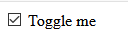
Lets Start with a simple Html file containing only below markup for the checkbox.
<label for="myCheckBox">
  <input id="myCheckBox" type="checkbox" />
  Toggle me
</label>
This markup renders a plain checkbox.
To style the checkbox we actually use a trick. We hide the plain html checkbox! Then we render another element which looks like a modern checkbox.
Hide the Default Checkbox
Step 1 is to hide the default checkbox, it can be done in done by various ways. I would use the new css property appearance. This property is supported by all modern browsers, if you are using Internet Explorer this won’t work for you.
In the css file add the below rule.
input[type="checkbox"] {
  appearance: none;
}
This rule set appearance none to all the inputs having type checkbox and make the default checkbox disappear. Only the label text should be visible after adding this style.
Next step is to style input[type="checkbox"] to make it look better.
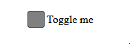
Lets start by making an empty box for the checkbox.
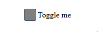
input[type="checkbox"] {
  appearance: none;
  height: 25px;
  width: 25px;
  border: 1px solid #34495e;
  border-radius: 4px;
  outline: none;
  background-color: gray;
}
It’s quite simple css to define dimensions and border of an element.
outline:none is used to avoid any special highlighting of element, you can choose to remove it.
This how the checkbox looks. You can’t see the check but we will work on that below.
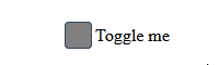
Add a span for the label text
Step 2 Now we add a span element to the label tag.
<label for="myCheckBox">
  <input id="myCheckBox" type="checkbox" />
  <span>Toggle me</span>
</label>
Lets center the label text as well, using flex.
label {
  display: flex;
}
input[type="checkbox"] + span {
  align-self: center;
}

input[type="checkbox"] + span selector means span adjacent to the input of type checkbox.
Style the tick
Our unchecked checkbox looks fine, lets style the check/tick.
We would display the unicode character “✔” over our empty checkbox when it is checked.
To do this we use the ::before pseudo element of our span.
input[type="checkbox"]:checked + span::before {
  content: "\2714";
}
Here \2714 is the unicode value of check mark. You can use any unicode value you like to show different characters, of course most of them won’t be check
marks.
We can see the check mark now, but its not what we want! Lets make check mark appear on the check box by using absolute position.
label {
  position: relative;
  display: flex;
}

input[type="checkbox"]:checked + span::before {
  content: "\2714";
  position: absolute;
  left: 0.7rem;
  top: 0.2rem;
}
We need to set position of label to relative as well, otherwise check mark will be shown on the top left corner. If you see check mark is a bit off, adjust top and left values.
Now the checkbox is completely functional and looks good. We can make some quick enhancement to make it look better. Lets user the pointer cursor on the checkbox and change the color in checked state.
label {
position: relative;
display: flex;
cursor: pointer;
}
input[type="checkbox"] {
appearance: none;
height: 25px;
width: 25px;
border: 1px solid #34495e;
border-radius: 4px;
outline: none;
background-color: gray;
cursor: pointer;
}
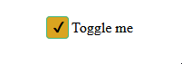
input[type="checkbox"]:checked {
border: 1px solid #41b883;
background-color: goldenrod;
}
I have chosen some random colors, you can tweak them to fit your design.
We can also add a transition-duration property to make transition between checked and unchecked state smoother.
input[type="checkbox"] {
  appearance: none;
  height: 25px;
  width: 25px;
  border: 1px solid #34495e;
  border-radius: 4px;
  outline: none;
  background-color: gray;
  cursor: pointer;
  transition-duration: 0.3s;
}
There is a very subtle change, you can increase the transition-duration to see it easily and then experiment with the value to see what looks better.
Below is the complete css used.
Note that I have used element selector for simplicity, in actual website you might want more specific selectors or classes.
input[type="checkbox"] {
  appearance: none;
  height: 25px;
  width: 25px;
  border: 1px solid #34495e;
  border-radius: 4px;
  outline: none;
  background-color: gray;
  cursor: pointer;
  transition-duration: 0.3s;
}

label {
  position: relative;
  display: flex;
  cursor: pointer;
}
input[type="checkbox"] + span {
  align-self: center;
}

input[type="checkbox"]:checked + span::before {
  content: "\2714";
  position: absolute;
  left: 0.7rem;
  top: 0.2rem;
}

input[type="checkbox"]:checked {
  border: 1px solid #41b883;
  background-color: goldenrod;
}